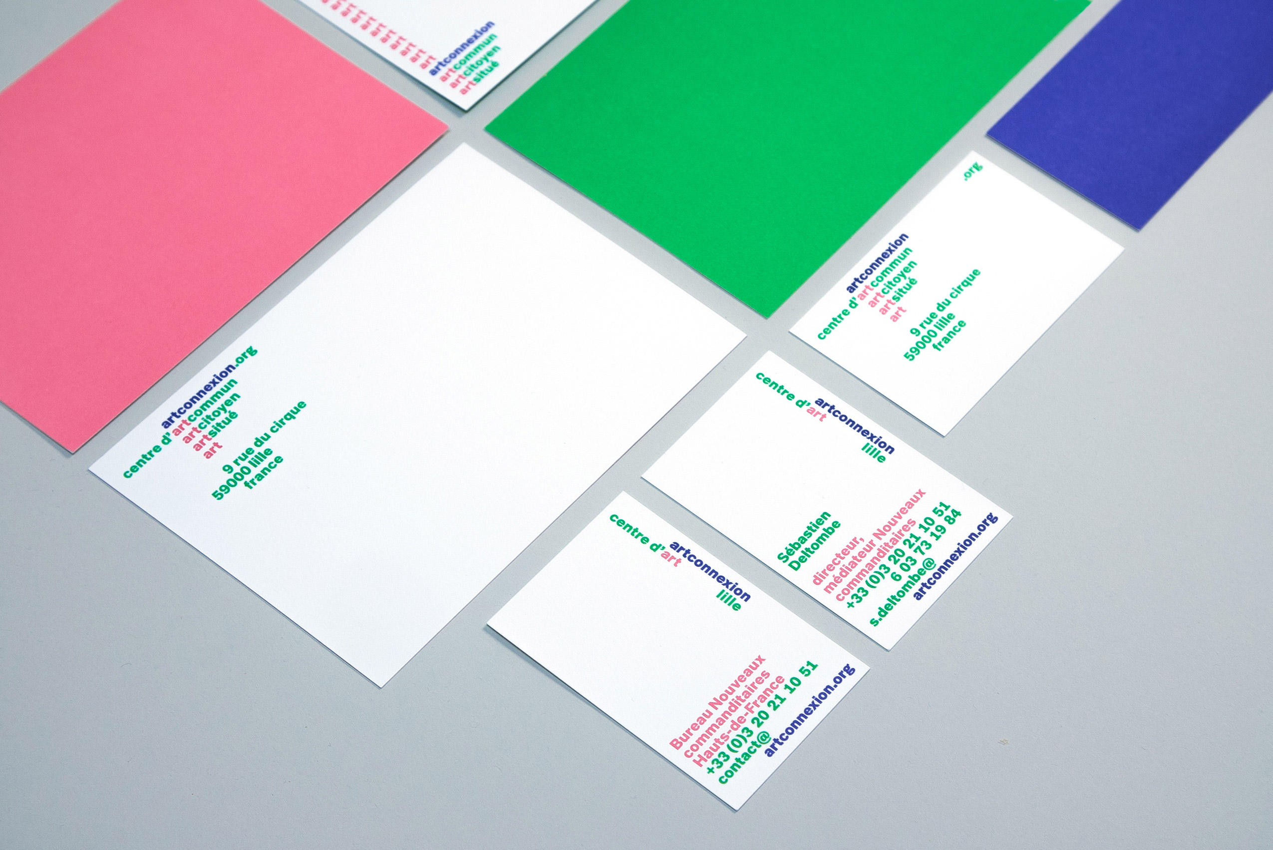
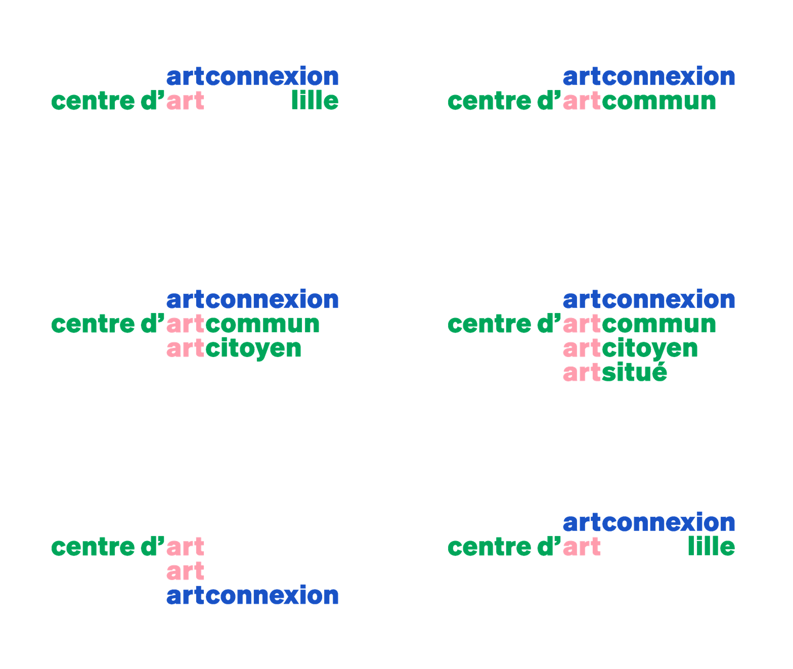
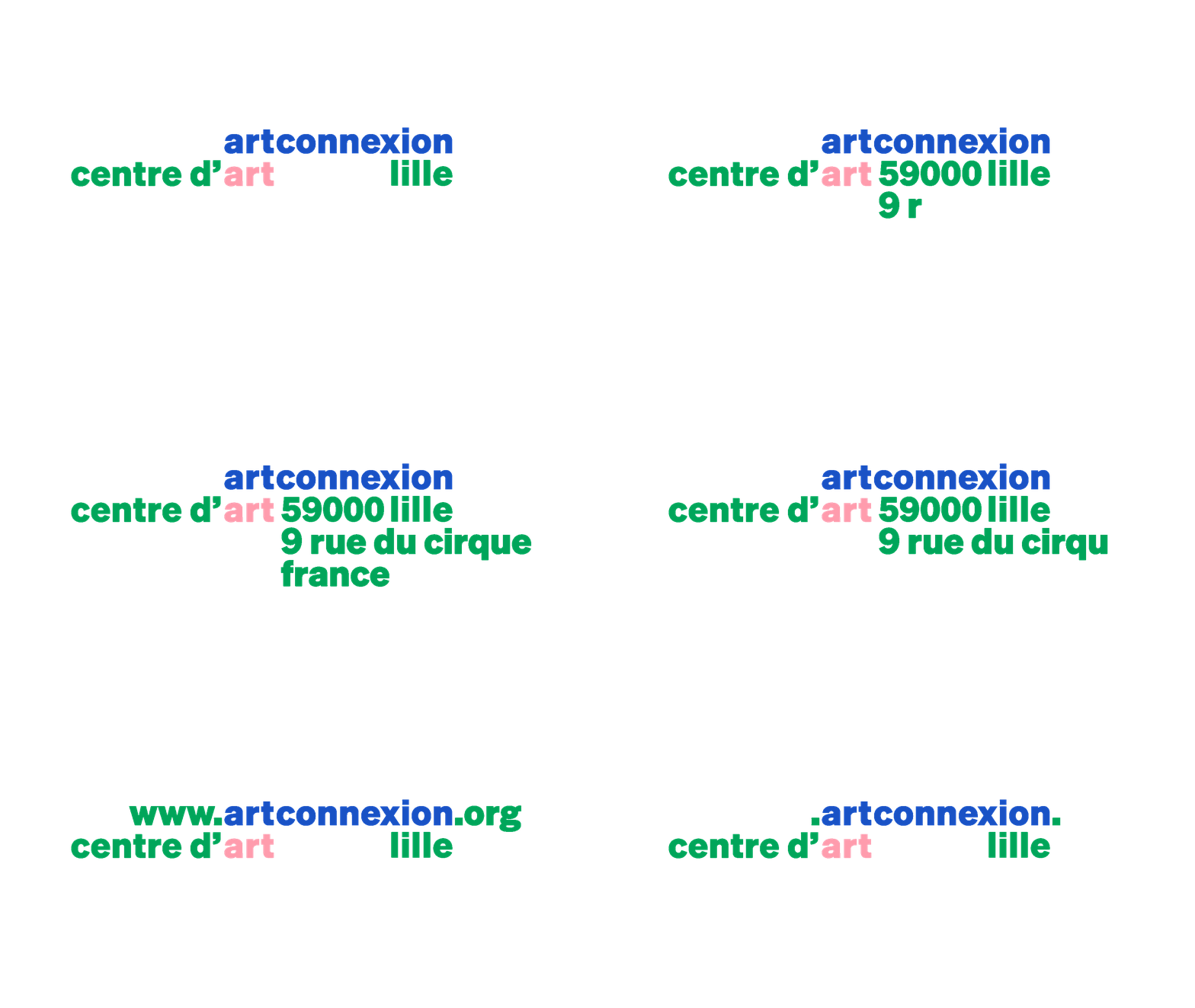
To mark its thirtieth anniversary, the art center artconnexion sought to reimagine its visual identity. Placing language at the core of this identity, the various logos are built around the repetition of the word “art”, which serves as a narrative tool to evoke artconnexion’s history and envision its future. Paired with “art”, words such as citoyen (citizen), commun (common), and situé (situated) define ways of making, thinking about, and sharing art; reflecting artconnexion’s unique and specific methodology.


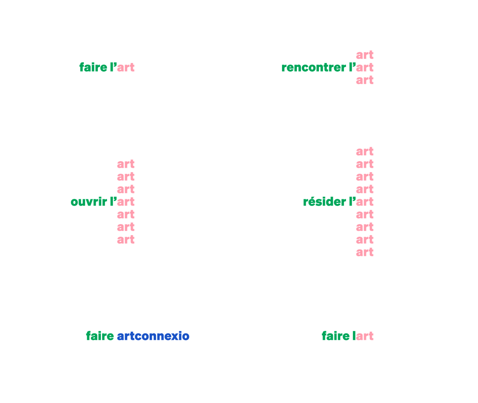
The spatial arrangement and combination of words vary widely, playing with orthogonality and repetition. Here, for instance, verbs associated with artconnexion evoke a specific way of acting and existing in the world, positioning the center as a site of contemporary action and experimentation.

A lyrical and spirited serif typeface, used for headlines, complements the identity on event posters. This new visual system is designed to be functional in its layouts, expressive and joyful through its color harmonies, and inclusive in its wording — ensuring artconnexion remains a vibrant, accessible, and socially engaged space.


